ShopDreamUp AI ArtDreamUp

Deviation Actions
![Adoptable Girl Art [Exclusive] OC (1822)](https://images-wixmp-ed30a86b8c4ca887773594c2.wixmp.com/f/0209f39c-e136-49ce-8ef3-c140509d7099/dh44pnk-ccdf2098-4f5f-4f95-b1e4-e5f0b0de3346.jpg/v1/fit/w_375,h_563,q_70,strp/adoptable_girl_art__exclusive__oc__1822__by_chadayan_dh44pnk-375w.jpg?token=eyJ0eXAiOiJKV1QiLCJhbGciOiJIUzI1NiJ9.eyJzdWIiOiJ1cm46YXBwOjdlMGQxODg5ODIyNjQzNzNhNWYwZDQxNWVhMGQyNmUwIiwiaXNzIjoidXJuOmFwcDo3ZTBkMTg4OTgyMjY0MzczYTVmMGQ0MTVlYTBkMjZlMCIsIm9iaiI6W1t7InBhdGgiOiJcL2ZcLzAyMDlmMzljLWUxMzYtNDljZS04ZWYzLWMxNDA1MDlkNzA5OVwvZGg0NHBuay1jY2RmMjA5OC00ZjVmLTRmOTUtYjFlNC1lNWYwYjBkZTMzNDYuanBnIiwiaGVpZ2h0IjoiPD0yODgwIiwid2lkdGgiOiI8PTE5MjAifV1dLCJhdWQiOlsidXJuOnNlcnZpY2U6aW1hZ2Uud2F0ZXJtYXJrIl0sIndtayI6eyJwYXRoIjoiXC93bVwvMDIwOWYzOWMtZTEzNi00OWNlLThlZjMtYzE0MDUwOWQ3MDk5XC9jaGFkYXlhbi00LnBuZyIsIm9wYWNpdHkiOjk1LCJwcm9wb3J0aW9ucyI6MC40NSwiZ3Jhdml0eSI6ImNlbnRlciJ9fQ.LlX51OBsO2qoMagfZ23my3_YRTNfYY19tCDIogW__s4)


Suggested Deviants


Suggested Collections


You Might Like…


Featured in Groups

Description
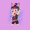
The Introduction for the 100 themes challenge. I like it.
Image size
2632x2819px 407.07 KB
Comments12
Join the community to add your comment. Already a deviant? Log In
Hmm, a very different picture compared to the last one I critiqued for you.
Another female, but a huge difference in pose and circumstance. Being a black & green fan, I rather like the color scheme you gave her, though there is something odd about her boot. It looks almost lime colored, and too shiny. Is it rubber? It doesn't seem like it would be if it has that fuzzy top to it. The textured ribbons around her body is nice, but I'm wondering about her pants. A nice design, but the top of the pants don't seem to be really outlined on her stomach. Staying around that region, is her staff supposed to have that white bit on it, between her legs? Going to her face, I think that it has a suggestive look to it, but her nose is very light compared to her skin, it kind of disappears a little more than you might want it to.
What I wanted to talk about the most was her anatomy. It is a very hard pose, I'm sure, but there are a lot of visual errors. Though her body is for the most part proportioned, some features look unnatural, such as the huge point coming out of her left elbow. The palm on the left hand seems rather undefined, but otherwise it looks alright, except for the fact that it does not look like her hand is resting on her knee (if you were going for that, that is). Also, the left leg's kneecap looks too thin for the size of her legs. The right knee might need to be positioned more to the top, rather than facing straight on. I really like how you did the connection between her neck and chest, but her right shoulder looks a little odd. The right arm's hand is drawn okay, but the way that arm is bent does not seem natural, or comfortable.
Lastly there is the depth. It is way off; partially by the shading, but also by the way you drew certain details. Her staff for example. When I looked at it, I expected it to end right beside or in front of her knee, but you're suggesting she is "sitting" on it, by the way you have it at the bottom. If you were aiming for that, then you may want to fix the way the pole is drawn out at the top. Angle it more, maybe. Also, another indication that there is no depth is under her breasts. It looks to me that they're big, but the way they are shaded suggests otherwise.
I love how you are so bold as to try difficult poses, and I would like to see more as you progress.
-Mrairs